VisitScotland is Scotland’s National Tourism Organisation.
I am currently working as part of the project team that is redeveloping the site. I was brought into the team a few months after the project started. My main task is to create new modules based on previous designs and adapt them to the UX accessibility requirements and development restrictions keeping in mind our design core values.
Background
To find who are the users and what they look for, we looked into Modern Human’s research that identifies the current usage of our website as being predominantly a practical information tool and an itinerary filler.
We are 11 people working on the project including UX, Design, Front End Developers, Back End Developers, and Content.
The design team is composed of 3 people.
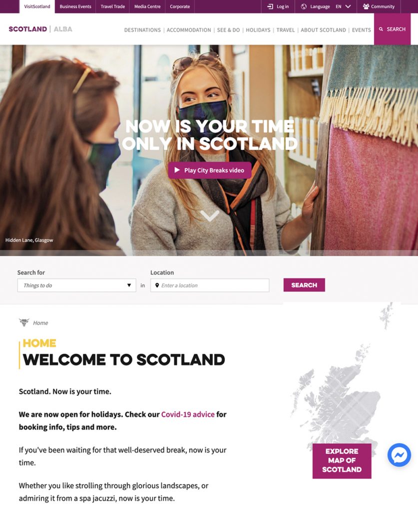
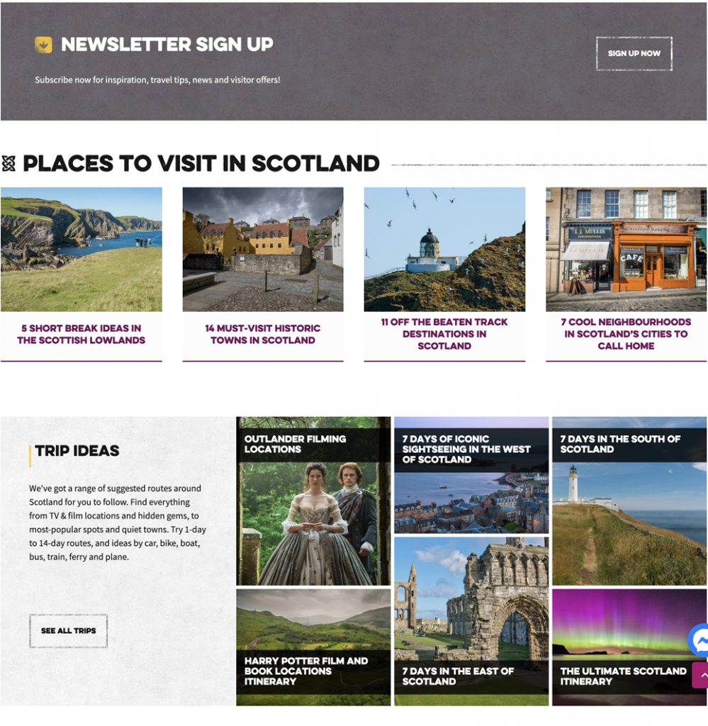
Current website
What does the visitor need?
Modern Human offered us the opportunity to identify these different archetypes and the needs of each group.
Explore the world enthusiasts
They look for experiences that are Inspiring and unique in the world and open to any experience at any time driven by visual content.
Time-bound solutionist
They have a clear, time-relative, ready-made travel idea. They will make rational choices about their holidays.
Backdrop hunters
They look for established holiday types. The navigation to organise their holiday needs to be straight-forward and easy to get into.
Destination romantics
They already have an idea of Scotland and are looking to find their idealised mental image to make the experience of Scotland their own.
Challenge
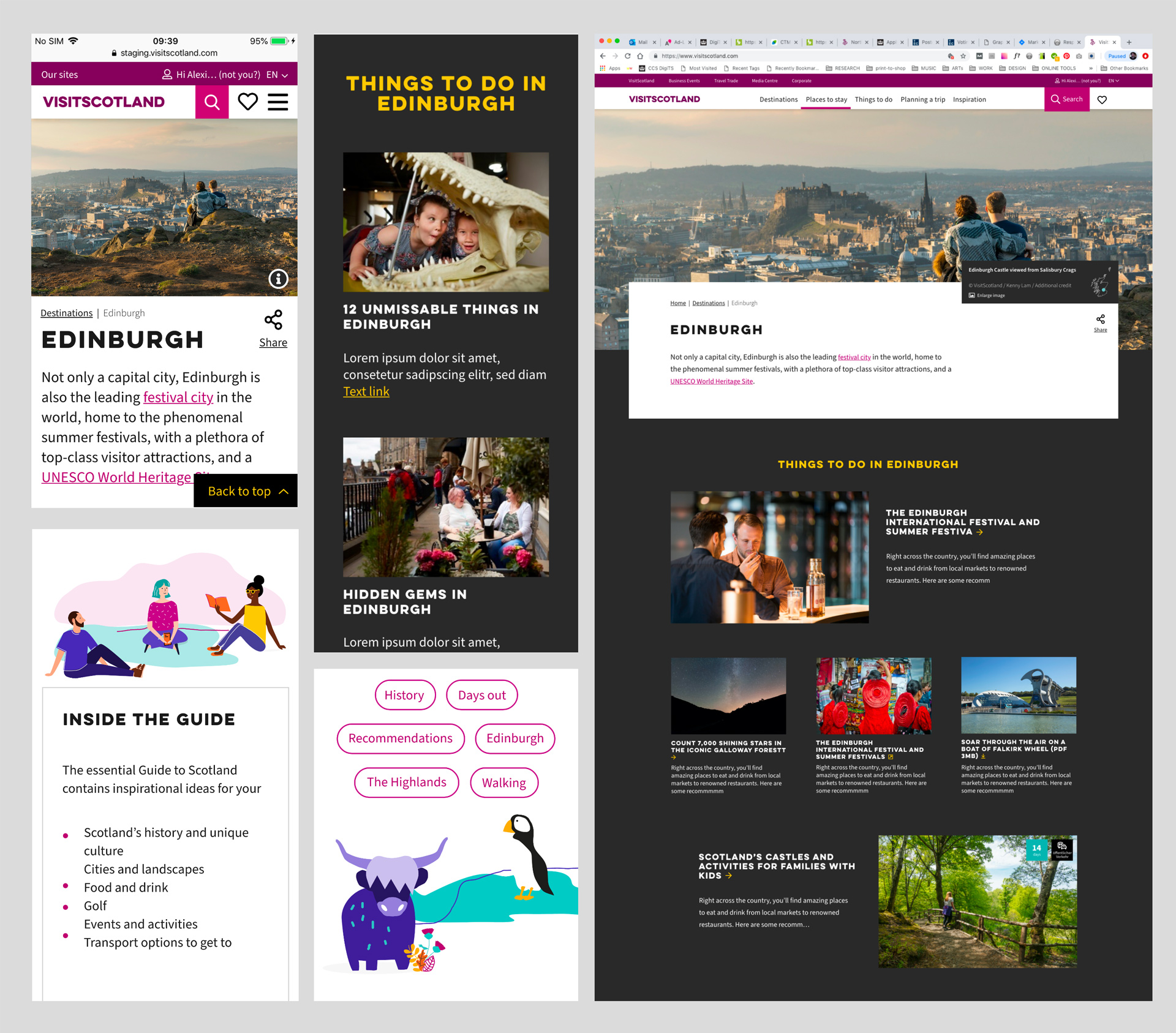
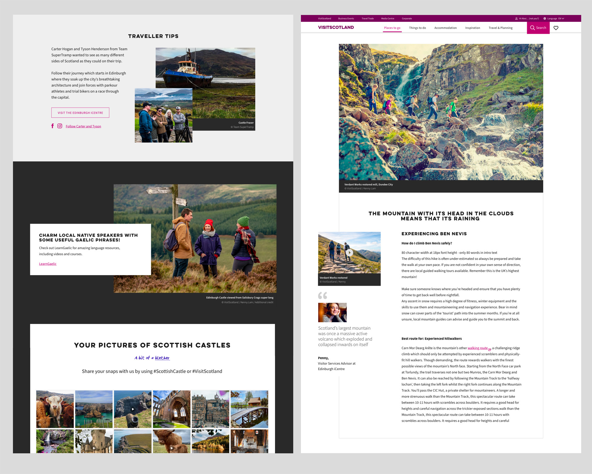
Our challenge is keeping the current practical tools as well as moving the focus towards a more inspirational platform for the first steps of the visitor journey. Showcasing:
Photographic, people-focused storytelling
Inspirational and inclusive content showing what makes Scotland unique
Local or specialist recommendations
Multiple types of experiences across a range of holiday formats
Itineraries filtered by duration and type of transport
Planning mechanisms
A coherent underlying visual concept that will both provide context and inspire the visitor’s dream experience.
The colour pink is used heavily in our corporate facing site, so we incorporated 4 colours to the colour palette to give the overall look a punch of vibrancy and a hint of warmth.
We are also using a dark shade to give some modules a bolder statement.
Another element that is allowing us to create a connection between the user and Scottish culture is using Scots phrases. Adding tips and itineraries from locals give a friendly and immersive experience when navigating the website.