We were tasked with rethinking the VisitScotland homepage to improve the user experience while evolving the brand towards a more inspirational and discovery-driven approach.
The challenge was to balance inspiration with practical trip-planning needs, support both international and domestic audiences, and highlight seasonal content — all while considering performance impact. The goal was not just a visual update, but a data-informed redesign grounded in user needs and business priorities.
Skills:
UX/UI Design
User Research & Analysis
Content Strategy & Optimisation
Agile Methodology
Approach
We worked collaboratively, across disciplines, to define an action plan to define an approach that would allow us to implement layout changes within the 5-day timeframe. This was as follows:
1. Research & Competitor Analysis
Reviewed existing user feedback.
Selected competitor homepages for new usability testing.
2. User Testing
Users reviewed 3 competitor homepages, including our own.
Users ranked homepage content by importance and identified unnecessary content.
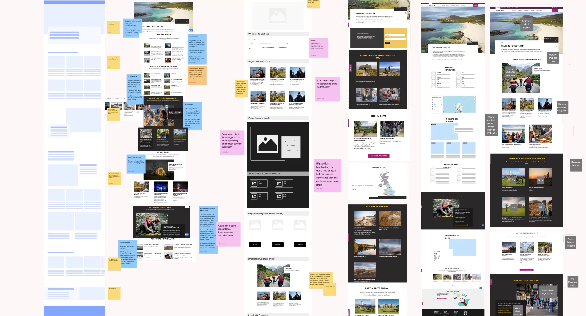
3. Wireframing
Discussed the user testing feedback.
Created wireframes based on initial research and past testing.
4. Recommendations
We refined the structure and layout to balance user and business needs.
We evaluated each section’s content for SEO and engagement.
Usability testing results
Shorter paragraphs, more images and videos
¨Save your favourites¨ widget
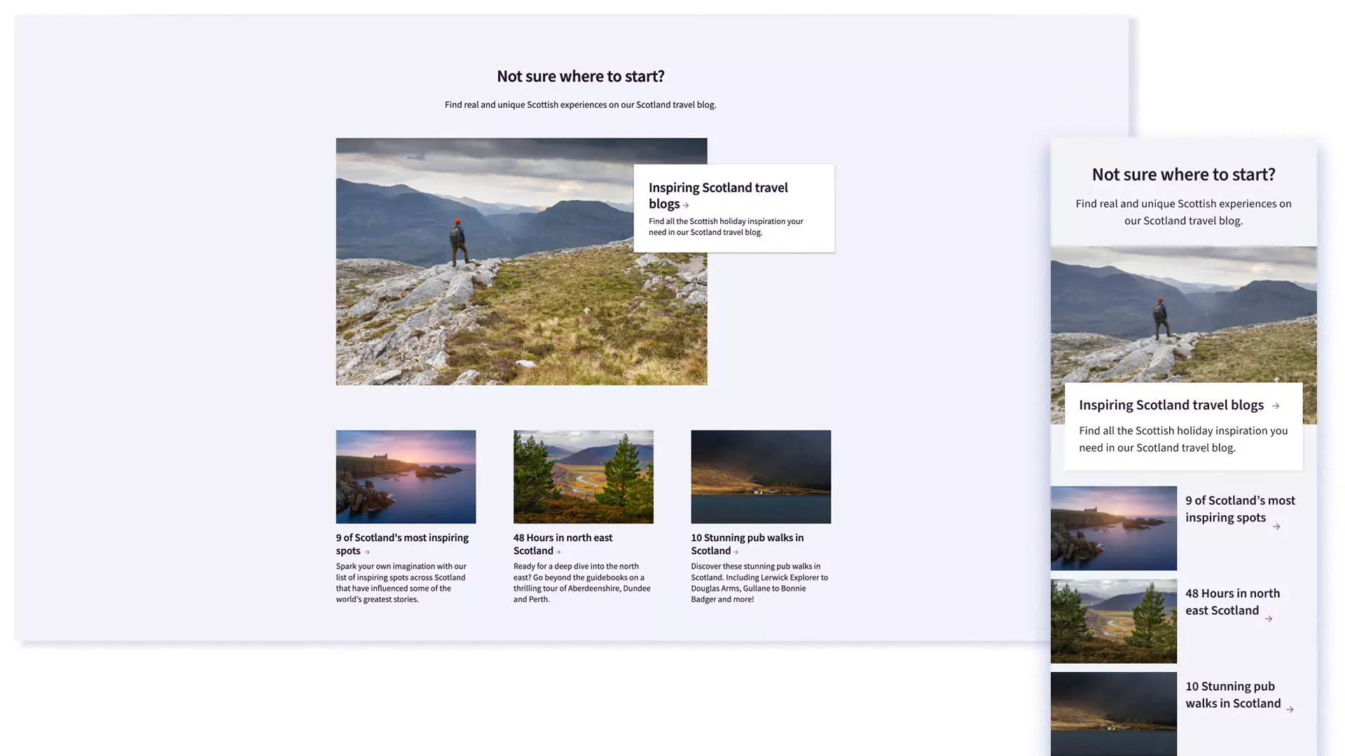
Travel blog section
Specify reading time on blog’s link
Create your journey widget
Map showing Scotland’s regions
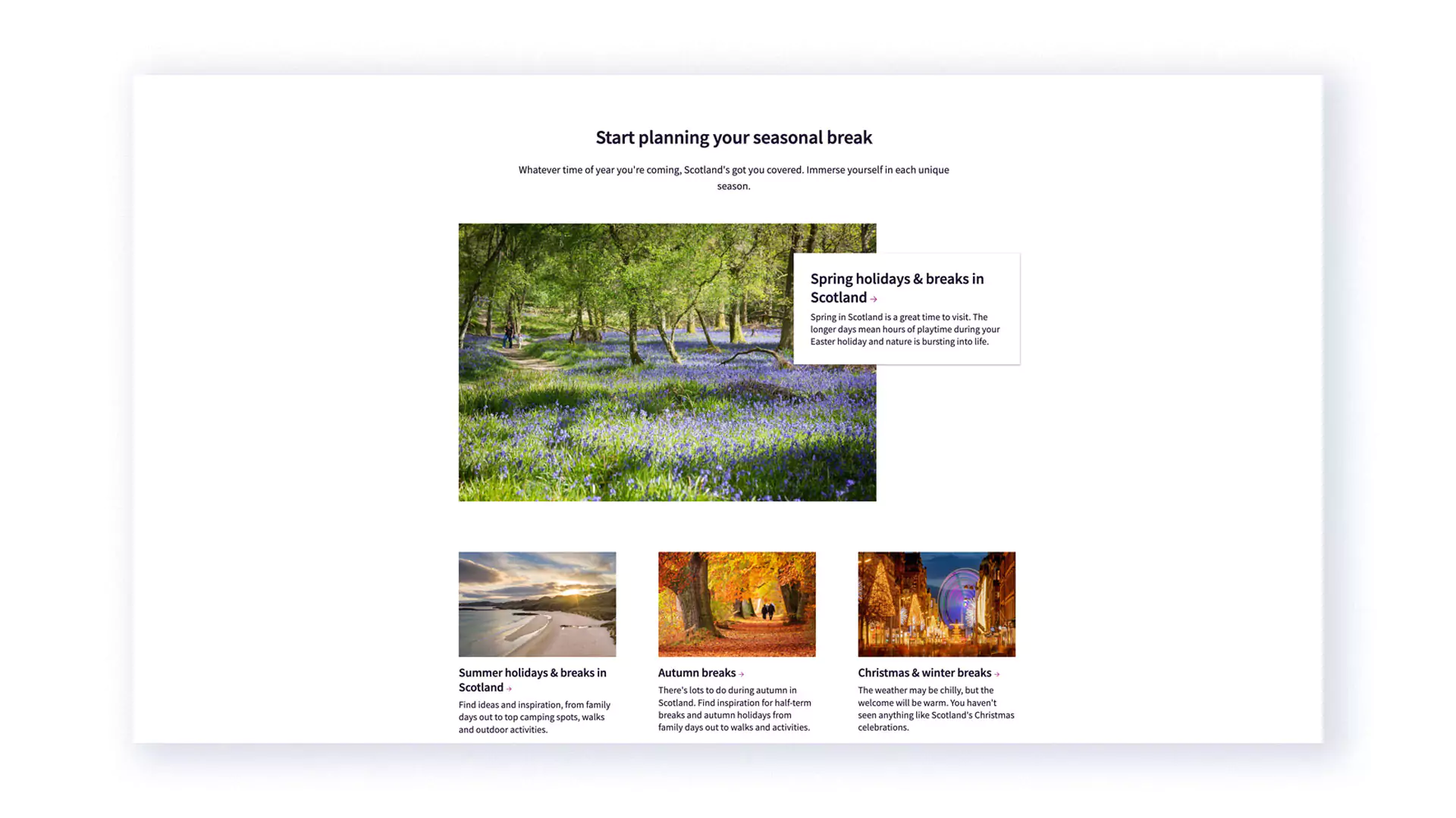
Seasonal content
Things to do canned search widget
Recommendations from locals
Useful travel advice content
Wireframing & recommendations
Using these insights, we created wireframes and refined the homepage structure to better balance inspiration, navigation, and trip-planning tools. We also evaluated content from an SEO and engagement perspective and proposed future improvements, including device-specific layouts, stronger seasonal storytelling, and clearer access to key pages.
Adaptive design
The general feedback between mobile and desktop did differ. We recommended that an adaptive design with device-specific layouts should be developed beyond the current responsive design.
Seasonal content
Presenting seasonal content will help users see what each season offers and decide when to visit Scotland.
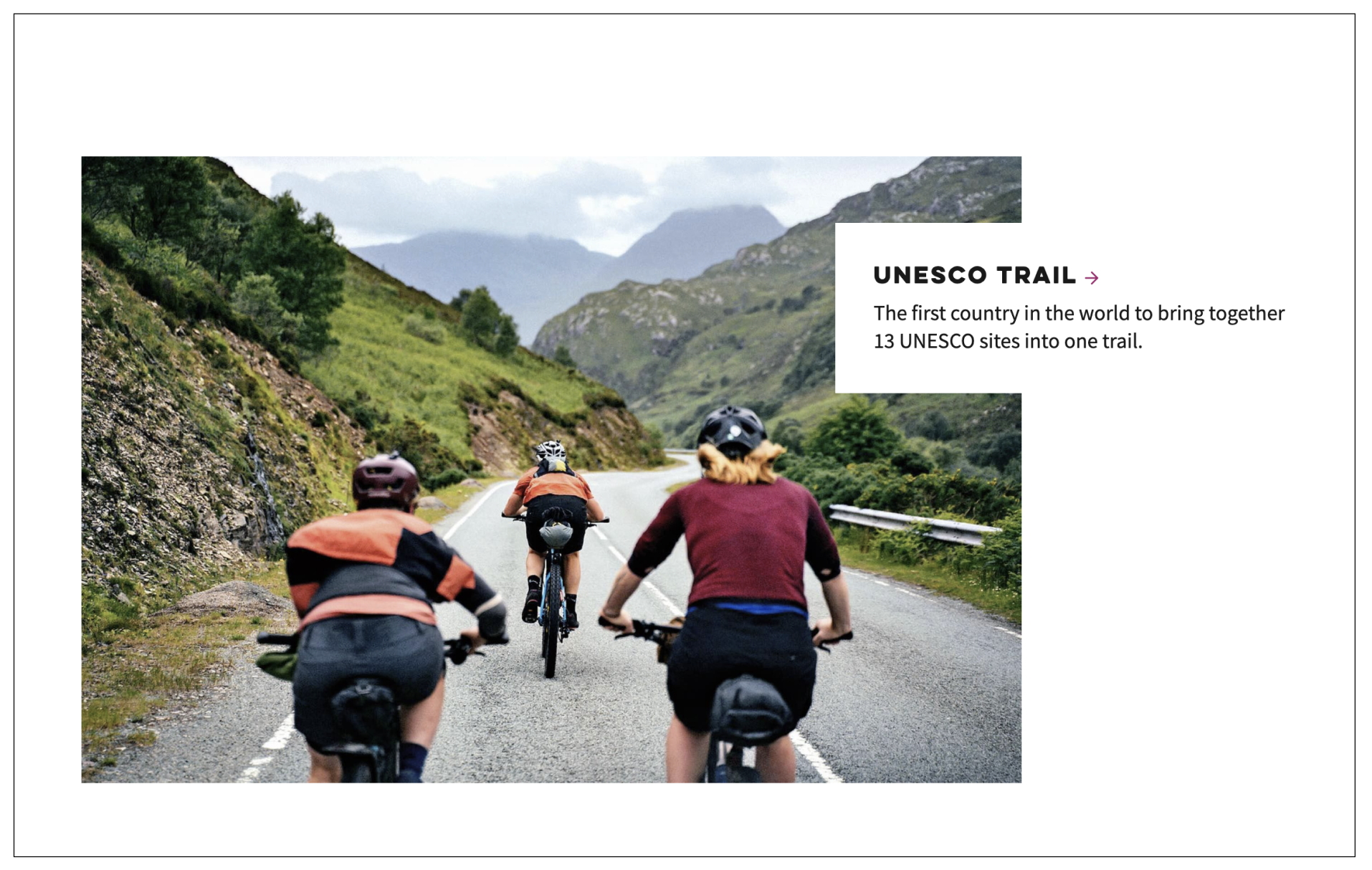
Inspirational content
Having an inspirational content section will get users excited about visiting Scotland and the wider site.
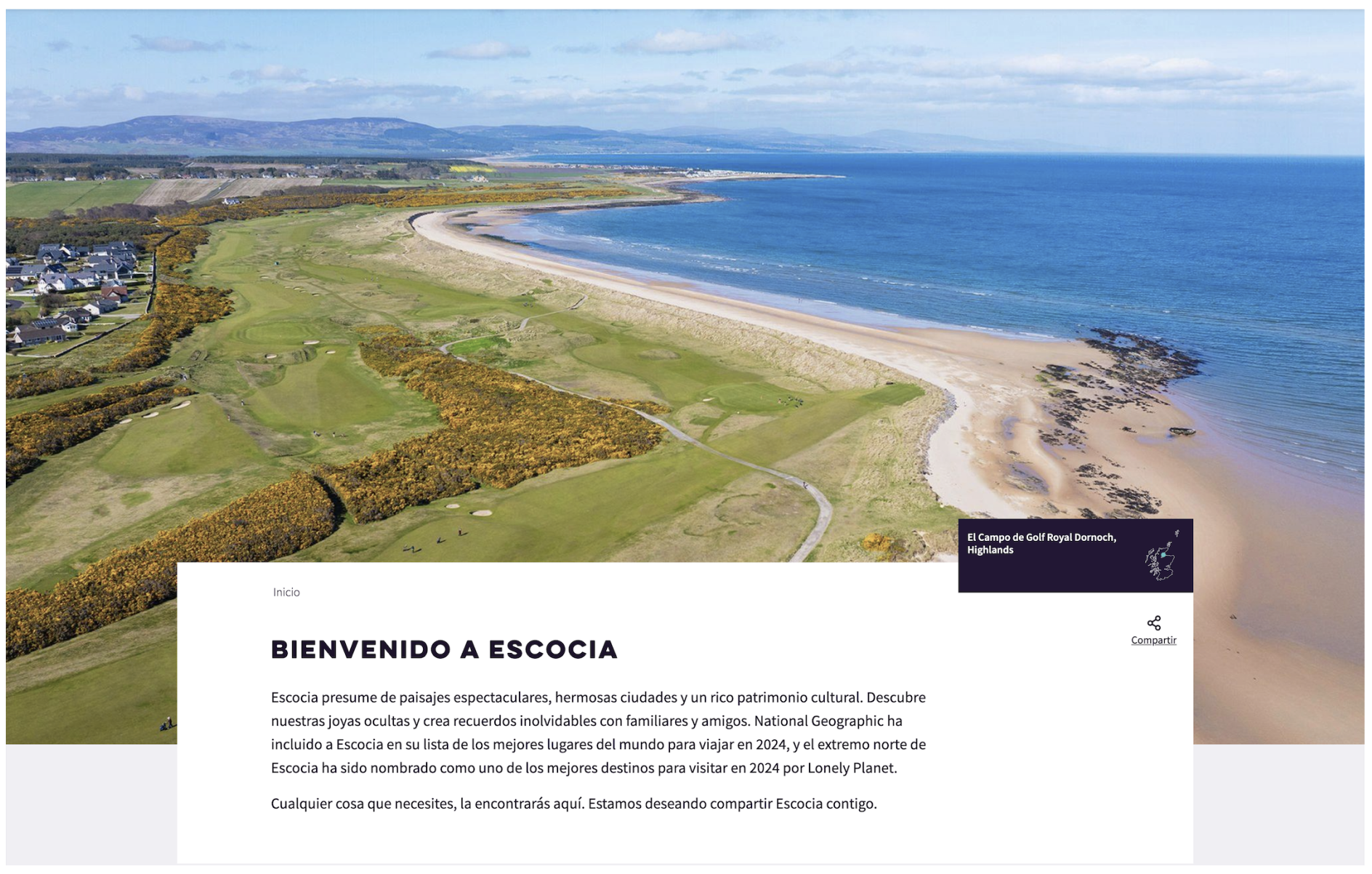
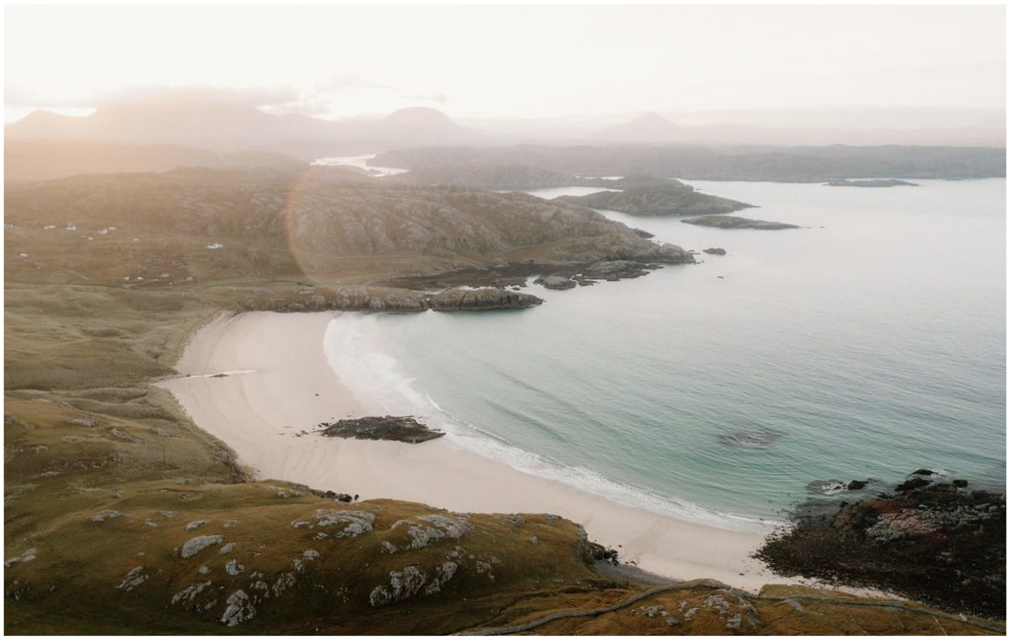
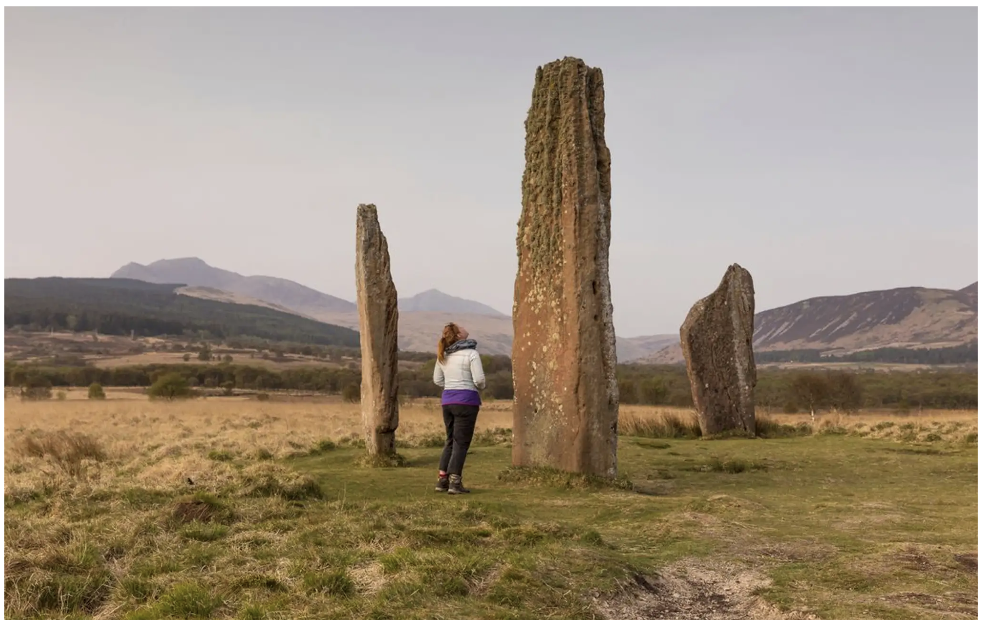
Inspirational images and videos
Lack of relevance between imagery and content. The visuals didn’t do justice to the real Scottish landscapes and landmarks.
Before
Recommendation
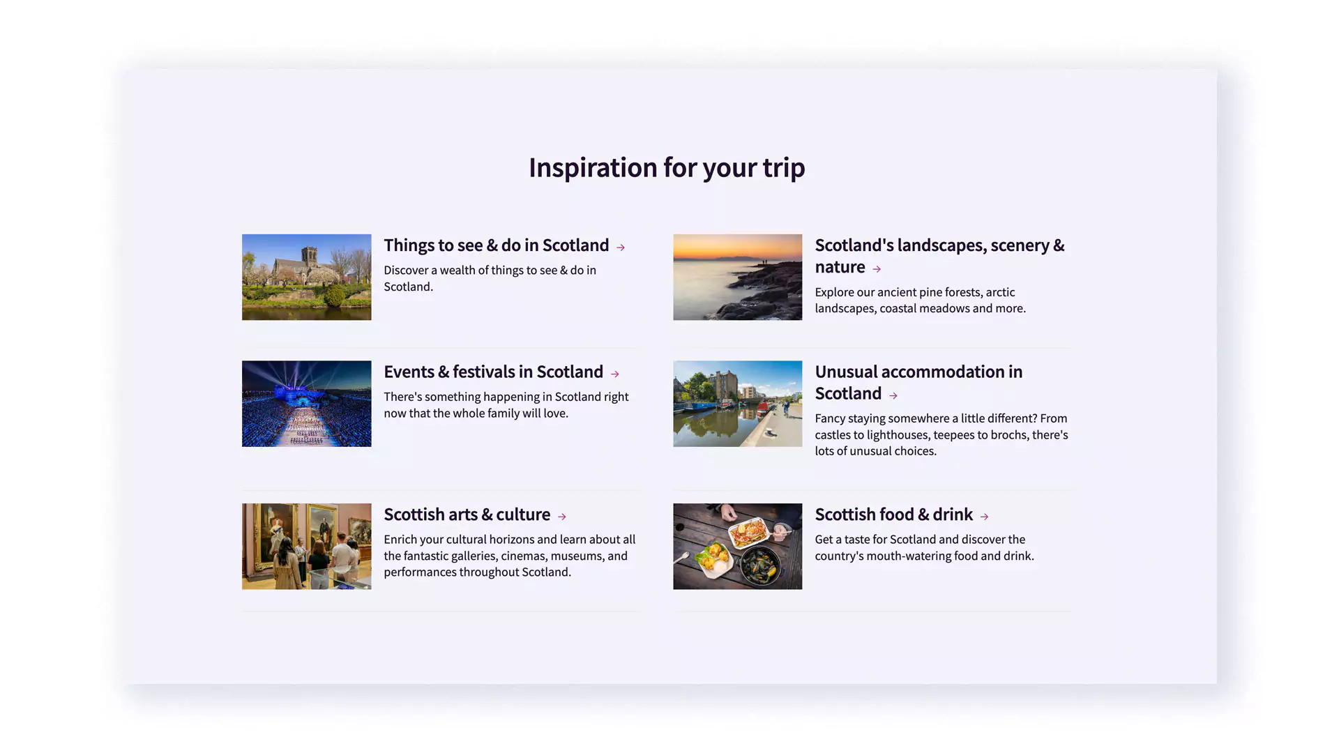
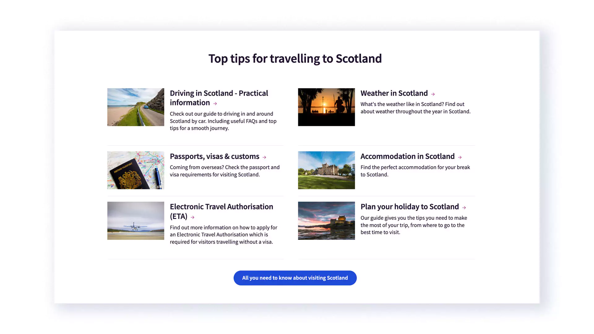
Links to key pages
Users prioritised links to key pages on the homepage for easy navigation. We added a section on the homepage with useful information that the users couldn’t find on the menu.
Outcome
Following an Agile methodology, we improved the homepage experience, working closely with a cross-functional team. Through rapid research, user testing, and wireframing, we optimised navigation and engagement. The homepage will have ongoing iterations and future testing will be done to keep refining the experience.